Blog Design Matters
A Blog’s design says something about who you are and what you have to offer. Use that first impression wisely.
If your design skills suck as much as mine (as in I know how I want my site to look but couldn’t figure out the tech end whatsoever, I urge you to outsource design. It’s one of those tasks that can eat up way too much time if you let it.
[bctt tweet=”A Blog’s design says something about who you are and what you have to offer” username=””]
*This post contains affiliate links. Clicking these links will lead you to awesome products that may help your blog. Purchasing through these links may help mine. Thanks!
I was a volunteer at the time. Working with teens who were struggling to find their place with their peers or their parents. Hoping to help bridge the gap. I sat in the office awaiting my meeting. As I browsed around I could see why the current counselor was not making strides with the students. Her office was cold, cluttered, and smelled of pungent coffee and old lady perfume.
The worn gray pantsuit she wore at least three days out of every five was a poly blend of uncomfortable. Hair perfectly pulled into the same bun every day and complimented by a gaudy shade of coral lipstick.
I had known this newer counselor for nearly a decade. Her paper accomplishments and accolades were nothing to scoff at. She worked her tail off in graduate school. But through her college years, she had yet to shed her insecure and somewhat shy high-school self.
The very teens she was trying to assist, were eating her lunch.
If Your Design Isn’t Working, Get Help
She wasn’t here today. I was filling in. This particular student had been giving her a run for her money the last two months. I was called in to help, hopefully.
I picked up the file and read through the usual teen angst issues and the goals this young woman was hoping to accomplish. Her list was short:
- Make a new friend- people don’t seem to like me.
- Get asked out on a date- have not been out with a boy in over a year.
- Find a babysitting job to help pay for the first year of college.
- Get my mom to stop screaming at me about my life.
- Apply to five colleges.
My counselor friend had been meeting with this girl for the last two months and had only succeeded in helping her fill out two college applications.
I was scratching my head wondering what the heck was the issue....and then she walked in.

I introduced myself and before she could say a word I said to her, “Clearly you already know what is causing the majority of your issues so why don’t you tell me why it is you are choosing not to fix them. Let us cut the bullsh*t and discuss what’s really holding you back.”
Don’t Hide Your Talent Behind A Poor Design
This 17yr old young woman walked in wearing clothes that fell straight from a porn rack.
I was trying to figure out how she had even got through the front door of the school.
Her face looked like it had been attacked by a fishing tackle box. One side of her head shaven and died black whilst the other side matted in red kool aid or some such concoction. Her arms were inked in tattoos she had drawn in her last class. Anger and hurt written all over the face she was trying to hide.
She slumped down in the chair. It took some poking and prodding but boiled down to her being angry with her mother for divorcing her father, and angry with her father for leaving and not even looking back. Ultimately not so much angry with her mother since she knew poor ole mom had been being cheated on for quite some time.
This beautiful, yes, under all that hiding she truly was gorgeous, young woman had tried to make herself as ugly as possible to hide.
If no one noticed her or got close to her, no one could hurt her.
But she stepped it up a notch. Instead of going for the plain Jane, she went for the scary Mary. So people were noticing. They were turned off and put off by her looks and her attitude she had adopted to complete the persona.
Your blog is like a book. Book covers matter.
I know the old adage. Don’t judge a book by its cover.
Some people won’t. There are the curious few who love a plain black leather cover, a mystery if you will. What do these pages hold?
But most people will.
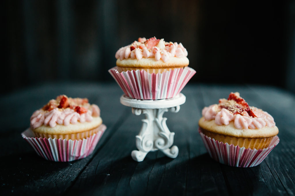
Look at the beautiful cupcakes above. Designed with care and purpose. Someone put some real effort into making them look extra scrumptious. Even for someone who doesn’t like cupcakes all that much, they can still say these are pretty.
The same should hold true for ourselves. We should put effort into our appearance and what we portray to those we wish to have in our lives.
Would you go to a job interview in your pajamas? How about on a date wearing your holy painting jeans? Would you hire a babysitter who looked like the girl above, to come hang out with your little girls? Probably not.
[bctt tweet=”If you want people to get to know what’s inside the pages, the cover matters.” username=””]
Of course, the kind of audience you are trying to attract will have some bearing on the image you want to convey.
If you are running a fitness blog, big pink flowers across the top of your header probably isn’t a good match. If you are writing about baby tips then it’s not a good idea to put fishing ads down the sidebar.
When designing your blog you are looking to accomplish two main things.
Fluidity and Addiction.
You want the design to be fluid. Each page feeling like an extension of another. Easy to navigate. A good clear message for readers that easily tells them what’s in store.
Fluidity in colors fonts, themes. This is why the niche conversation comes up so much. Bloggers who tend to touch on everything, rarely succeed at anything. While I certainly believe you can have more than one main interest, you definitely need to narrow them down to just a few.
Your ads should relate to your message. Why put Nordstrom dresses on a budget blog? Not a good idea.
When looking for sponsored post opportunities or affiliates to work with, make sure to stay within your ideal niche or audience. If you are a fitness blogger who does a sponsored post for Lindor truffles, don’t expect your fitness audience to hang out. And if you manage to get some truffle fans, don’t expect them to buy your fitness ebook.
Addiction to Your Blog
You want people to come back to your site again and again. This is one of those google metrics that many bloggers get frustrated with. Returning visitors is a huge deal. Most bloggers are lucky if 35% are returning visits. For a new blogger is usually less than 5% until you have established some authority in your niche.
The people who come back more than once are the ones who are likely to subscribe to your email list and ultimately purchase your products if you have any.
Even if you aren’t looking to make money from your blog you want this. Addiction and returning visitors create a community who will share and engage with your words.
You should strive to make your blog as enticing as those pretty little cupcakes above.
So how can we do that?
Five little Tips for you to Improve your Blog’s Design Today.
- Use three fonts max and make sure they complement one another. No swirly cursive or hard to read old English text, please.
- No black backgrounds. I love black but when you use white or colored text over a black page, people will not stick around long. I think this goes for all colored backgrounds. Be careful. Creative is good. Causing cataracts from staring at hard to read screens, not so much.
Check out your favorite blogs, chances are all of them use a white backlay.
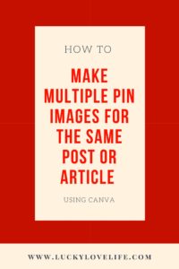
- Clear, crisp photos. If you don’t want to hunt for stock photos or take your own check out Canva. You can make incredibly sharp images for your blog posts here. And hey, feel free to use black all you want. Below are two examples of pins I made using no photos and bright colors. Keep in mind though Canva has tons of stock images that you can use for free or you can upgrade for even more images dirt cheap. The first I made from scratch. The second was an image available for free on Canva.


- Flow. Is your site easy to navigate and find related topics? This was something that I really struggled with in the beginning and am still working on.
- Cleaner is better. Look at Abby Lawson’s site “Just a girl and her blog“. This site is sharp. No distractions. Just awesome content again and again. Her images are all the same size. She uses the same fonts over and over. The colors complement one another and do not overpower her reader. The sidebar is sharp. You might not be able to get away from ads for a while if you are just starting out. Just make sure your ads aren’t obnoxiously placed all over your content. Abby’s success in a single year is what inspired me to get this blogging thing in gear. She knows her stuff.
Have Some Pride in Your Design
Many people are afraid to share their blogs with friends and family. They want it to be doing well before they open up to anyone. Having a good professional design should help ease the anxiety of someone “finding” your blog before you are reading to share.
I’m proud to announce that after only three sessions with my young friend above we were able to get her applied to all of her ideal colleges, a lunch date with a boy she liked, and a dinner date with her own mom. She also secured a job reading to children at a local bookstore, after a serious wardrobe cleansing and back from Ozzfest makeover.
She decided she wanted to be noticed for what was truly in her heart’s desire.
Your blog should do the same. So go and check out your favorite blogs. You shouldn’t want to copy them but do figure out what it is that draws you in and parallel that to what will draw your ideal audience in!
xoxo-Deanna
P.S. Make sure you have a clear, excellent pic with a bio excerpt on your sidebar. People want to know a little about the author and what they are offering. Pages with bios are clicked more than double the rate of those without.